伪元素
定义
伪元素顾名思义伪装成元素,但不是元素,这与生成内容相关。生成内容主要指由浏览器创建的内容,而不是由标志或内容来表示。生成内容主要由:before和:after伪元素来实现,当然伪元素还包括:first-line,:first-letter和::selection
用法
:first-letter
指定一个元素第一个字母的样式
[注意1]所有前导标点符号应与第一个字母一同应用该样式
[注意2]只能与块级元素关联
[注意3]只有当选择器部分和左大括号之间有空格时,IE6-浏览器才支持。因为first-letter中存在连接符的原因
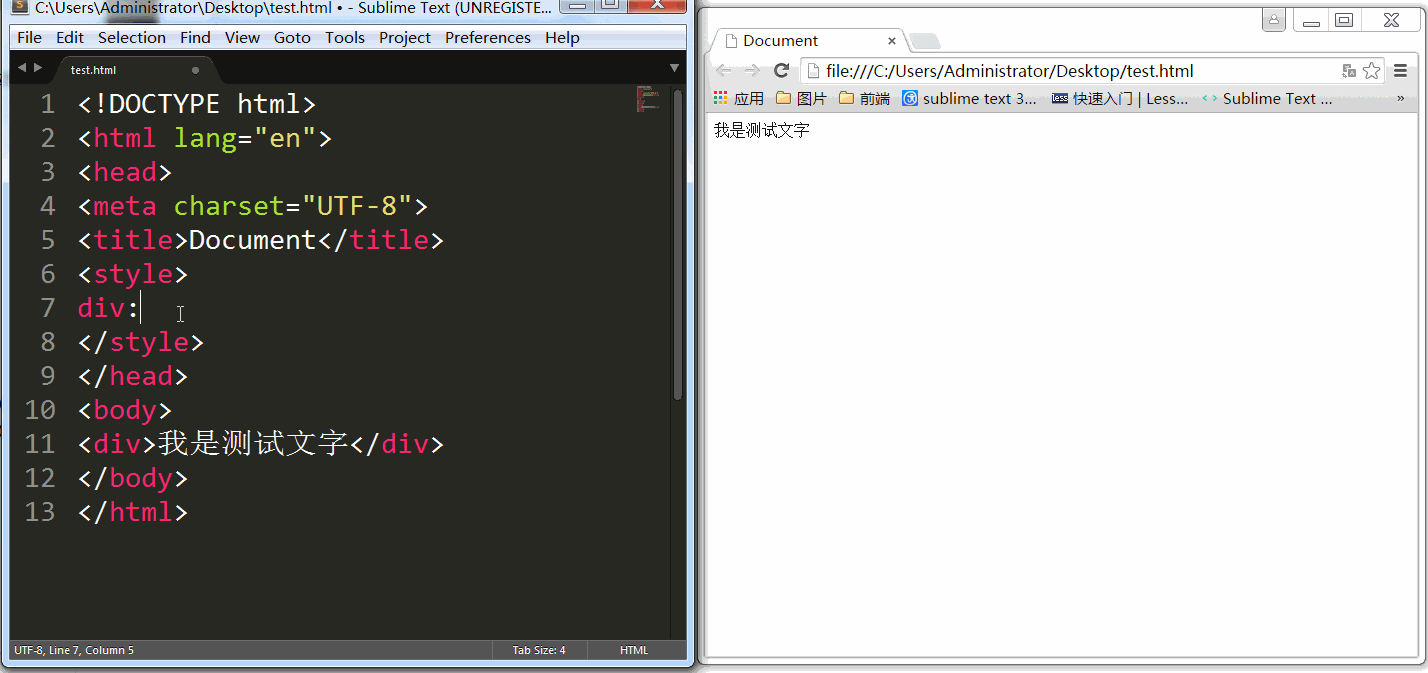
div:first-letter{color: red;}:first-line
设置元素中第一行文本的样式
[注意1]只能与块级元素关联
[注意2]只有当选择器部分和左大括号之间有空格时,IE6-浏览器才支持。因为first-line中存在连接符的原因
div:first-line{color: red;} 
:before(IE7-浏览器不支持)
在元素内容的最开始插入生成内容
[注意]默认这个伪元素是行内元素,且继承元素可继承的属性;IE7-浏览器中必须声明!DOCTYPE,否则不起作用
div:before{content:"前缀"}:after(IE7-浏览器不支持)
在元素内容的最后插入生成内容
[注意]默认这个伪元素是行内元素,且继承元素可继承的属性;IE7-浏览器中必须声明!DOCTYPE,否则不起作用
div:after{content:"后缀"}
::selection(IE8-浏览器不支持)
匹配被用户选择的部分
[注意1]firefox浏览器需要添加-moz-前缀
[注意2]只支持双冒号写法
[注意3]只支持颜色和背景颜色两个样式
div::selection{color: red;}
重点
【content属性】
content属性应用于before和after伪元素
content:normal;(默认)
content:<string>|<uri>|attr(<identifier>)
【1】<string>里面的内容会原样显示,即使包含某种标记也不例外。
[注意1]如果希望生成内容中有一个换行,则需要使用\A
[注意2]若是一个很长的串,需要它拆分成多行则需要用\对换行符转义
div:before{
    content: "第一段\
              第二段";
}
div:after{
    content:"\A后缀";
}
【2】<uri>
div:before{
    content: url("arrow.gif");
}
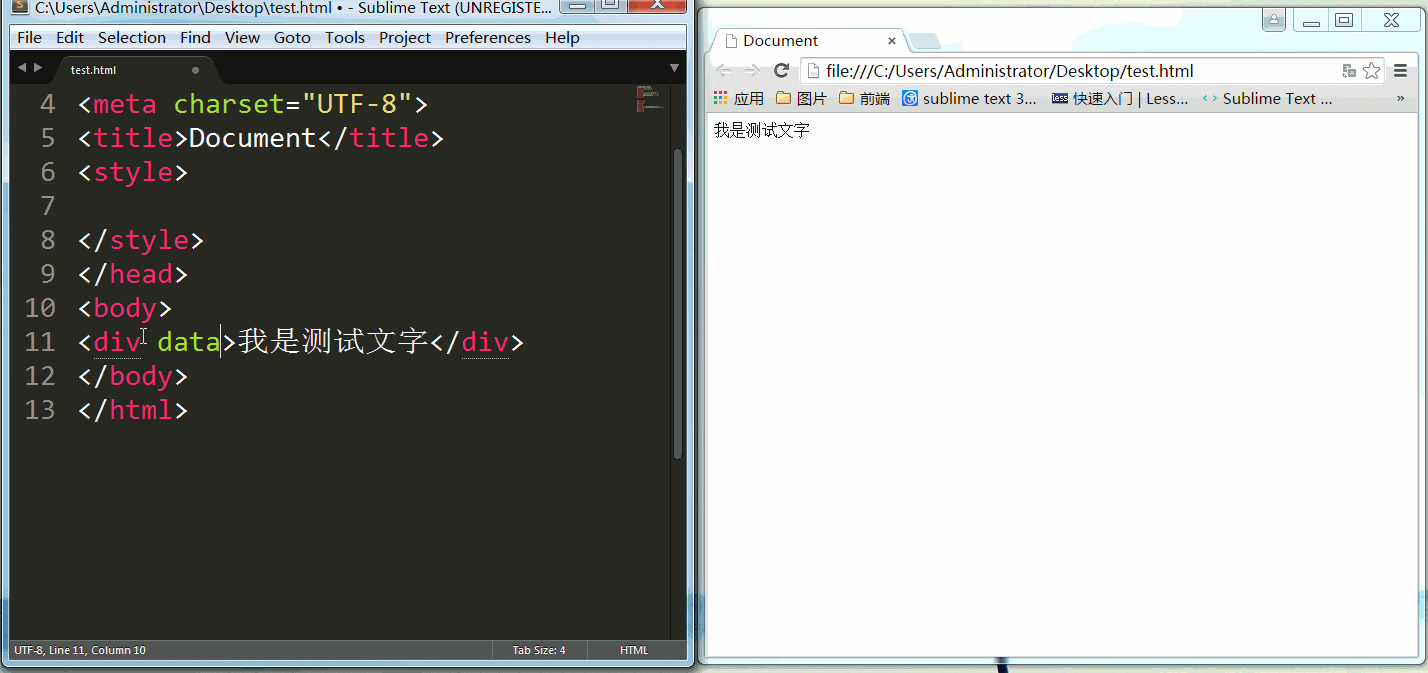
【3】attr(<identifier>)
div:before{
    content: attr(data-before);
}
<补充>【quotes属性】
管理引号
前单引号 -> \2018
后单引号 -> \2018
前双引号 -> \201C
后双引号 -> \201D
quotes:'201C' '201D' '2018' '2019';//第一个值定义最外层开始引号(open-quote),第二个串定义最外层结束引号(close-quote),第三个值定义次外层开始引号,第四个值定义次外层结束引号,第五个值定义次次外层开始引号,第六个值定义次次外层结束引号……
【4】open-quote|close-quote
<style>
div{
    display: inline-block;
    quotes: '201C' '201D' '2018' '2019' '201C' '201D';
}
div:before{
    content: open-quote;
}
div:after{
    content: no-close-quote;
}
</style>
<div>
最外层<div>
次外层
<div>
最里层
</div>
</div>
</div> 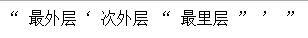
【5】counter
关于counter属性值,详见深入理解CSS计数器
DEMO
首字下沉
<style>
div{
    width: 200px;
    border: 1px solid black;
    text-indent: 0.5em;
}
div:first-letter{
    font-size: 30px;
    float: left;
}
钉子效果
<style>
/*使用before伪元素画圆*/
.box:before{
    display:block;
    content:"钉子";
    height: 50px;
    width: 50px;
    border-radius: 50%;
    background-color: black;
    color: white;
    font-weight:bold;
    text-align: center;
    line-height: 50px;
}
/*使用after伪元素画三角*/
.box:after{
    display: block;
    content: "";
    width: 0;
    height: 0;
    border: 25px solid transparent;
    border-top: 50px solid black;
    margin-top: -20px;
}
</style>
<div class="box"></div>
图片叠加效果
<style>
body{
    margin: 0;
}
.box{
    position:relative;
    margin: 30px auto 0;
    width: 300px;
}
.box-img{
    position: absolute;
    z-index:1;
    border: 5px solid gray;
}
.box:before,.box:after{
    content:"";
    position: absolute;
    background-color: #D5B07C;
    width: 300px;
    height: 200px;
    border: 5px solid gray;
}
.box:before{
    left: -10px;
    top: 0;
    transform: rotate(-5deg);
}
.box:after{
    top: 4px;
    left: 0;
    transform: rotate(4deg);
}
</style>
<div class="box">
<img class="box-img" src="diejia.jpg" alt="图片叠加效果">
</div>