单位
本文分为绝对长度单位和相对长度单位来介绍CSS中的长度单位的主要知识
绝对长度单位
绝对长度单位代表一个物理测量
像素px(pixels)
在web上,像素px是典型的度量单位,很多其他长度单位直接映射成像素。最终,他们被按照像素处理
英寸in(inches)
1in = 2.54cm = 96px
厘米cm(centimeters)
1cm = 10mm = 96px/2.54 = 37.8px
毫米mm(millimeters)
1mm = 0.1cm = 3.78px
1/4毫米q(quarter-millimeters)
1q = 1/4mm = 0.945px
点pt(points)
1pt = 1/72in = =0.0139in = 1/722.54cm = 1/7296px = 1.33px
派卡pc(picas)
1pc = 12pt = 1/6in = 1/6*96px = 16px
字体相关相对长度单位
em、ex、ch、rem是字体相关的相对长度单位
em
em表示元素的font-size属性的计算值,如果用于font-size属性本身,相对于父元素的font-size;若用于其他属性,相对于本身元素的font-size
<style>
.box{font-size: 20px;}
.in{
    /* 相对于父元素,所以2*2px=40px */
    font-size: 2em;
    /* 相对于本身元素,所以5*40px=200px */
    height: 5em;
    /* 10*40px=400px */
    width: 10em;
    background-color: lightblue;
}
</style>
<div class="box">
<div class="in">测试文字</div>
</div>rem
rem是相对于根元素html的font-size属性的计算值
兼容性: IE8-不支持
<style>
/* 浏览器默认字体大小为16px,则2*16=32px,所以根元素字体大小为32px */
html{font-size: 2rem;}
/* 2*32=64px */
.box{font-size: 2rem;}
.in{
    /* 1*32=32px */
    font-size: 1rem;
    /* 1*32=32px */
    border-left: 1rem solid black;
    /* 4*32=128px */
    height: 4rem;
    /* 6*32=192px */
    width: 6rem;
    background-color: lightblue;
}
</style>
<div class="box">
<div class="in" id="test">测试文字</div>
</div>默认地,浏览器的字体大小font-size是16px,也就是1rem=16px。而如果将HTML的font-size设置为100px,方便后续计算,不设置为10px是因为chrome下最小字体大小为12px
ex
ex是指所用字体中小写x的高度。但不同字体x的高度可能不同。实际上,很多浏览器取em值一半作为ex值
[注意]ex在实际中常用于微调
<style>
.box{font-size: 20px;}
.in{
font-size: 1ex;
border-left: 1ex solid black;
height: 10ex;
width: 20ex;
background-color: lightblue;
}
</style><button>宋体</button><button>微软雅黑</button><button>arial</button><button>serif</button>
<div class="box">
    <div class="in" id="test">测试文字</div>
</div><script>
var aBtns = document.getElementsByTagName('button');
for(var i = 0; i < aBtns.length; i++ ){
aBtns[i].onclick = function(){
test.style.fontFamily = this.innerHTML;
}
}
</script>ch
ch与ex类似,被定义为数字0的宽度。当无法确定数字0宽度时,取em值的一半作为ch值
兼容性: IE8-不支持
[注意]ch在实际中主要用于盲文排版
<style>
.box{font-size: 20px;}
.in{
    font-size: 1ch;
    border-left: 1ch solid black;
    height: 10ch;
    width: 20ch;
    background-color: lightblue;
}
</style>
<button>宋体</button><button>微软雅黑</button><button>arial</button><button>serif</button>
<div class="box">
<div class="in" id="test">测试文字</div>
</div><script>
var aBtns = document.getElementsByTagName('button');
for(var i = 0; i < aBtns.length; i++ ){
aBtns[i].onclick = function(){
test.style.fontFamily = this.innerHTML;
}
}
</script>
视口相关相对长度单位
视口相关的长度值相对于初始包含块的大小。当初始包含块的宽高变化时,他们都会相应地缩放。然而,当根元素的overflow值为auto时,任何滚动条会假定不存在。
关于视口相关的单位有vh、vw、vmin、vmax4个单位
兼容性:IE8-不支持,IOS7.1-不支持,android4.3-不支持(对于vmax,所有IE浏览器都不支持)
[注意]黑莓错误的将其相对于视觉视口来计算;而safari奇怪地相对于html元素来计算,如果html中增加了内容,这两个单位也会发生变化
vh
布局视口高度的 1/100
vw
布局视口宽度的 1/100
<style>
body{margin: 0;}
.box{
    /* 实现与屏幕等高的效果 */
    height: 100vh;
    background-color: lightblue;
}
</style>
<div class="box"></div>
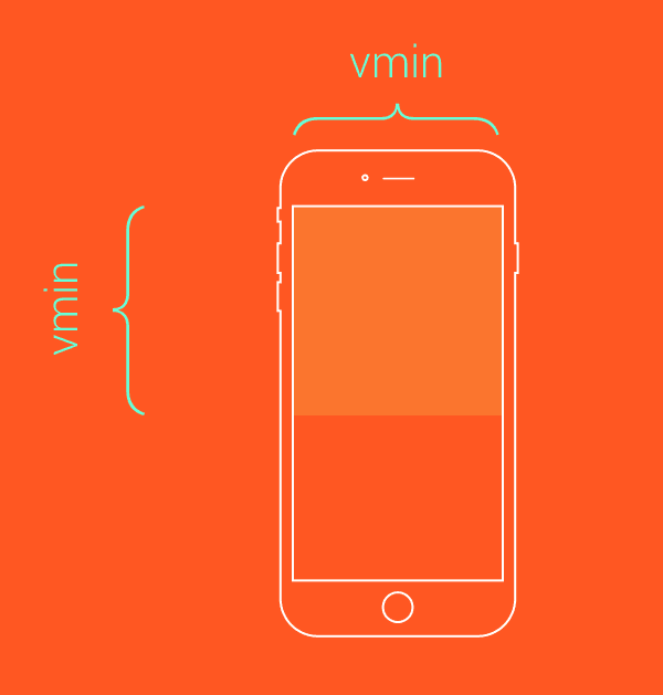
vmin
布局视口高度和宽度之间的最小值的 1/100
/*类似于contain效果*/
.box{
    height: 100vmin;
    width: 100vmin;
}
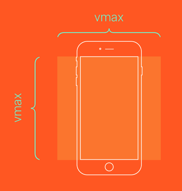
vmax
布局视口高度和宽度之间的最大值的 1/100
/*类似于cover效果*/
.box{
    height: 100vmax;
    width: 100vmax;
}