实现滑动门的三种方法
定义
在border-radius出现之前,实现圆角效果使用的是滑动门。滑动门是利用背景图像的可层叠性,并允许他们在彼此之上进行滑动,以创造一些特殊的效果。
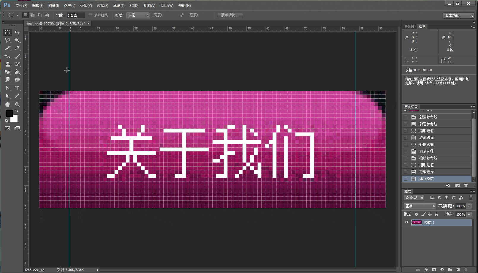
案例效果

切图
实现方法
滑动门的实现共三种方法:三层嵌套、两层嵌套和绝对定位。
三层嵌套
三层嵌套,文字只能写到最里面的div里,适用于图片比较大或者拓展要求高,比如导航。
[注意1]要想让滑动门适用于多种场合,左右两个角必须透明,以此露出背景颜色,若是左右压中间,左右角的透明部分露出的是中间的颜色,所以只能改成中间压左右,然后中间用margin,不与左右相叠压。
[注意2]因为滑动门需要宽度自适应,对最外层的<div>用float或inline-block使其宽度由内容撑开
.boxL{
    display: inline-block;
    background: url('boxL.png') no-repeat left 0 ;
}
.boxR{
    background: url('boxR.png') no-repeat right 0;
}
.box{
    background: url('boxM.jpg') repeat-x;
    font: 14px/30px "宋体";
    color: white;
    padding: 1px 10px 0;
    margin: 0 8px;
}
<div class="boxL">
<div class="boxR">
<div class="box">关于我们</div>
</div>
</div>
两层嵌套
两层嵌套,文字只能写到最里面的div里,局限是文字最多只能到父级div的宽度,适用于图片比较小或者拓展要求小,比如按钮。
.boxR{
    display: inline-block;
    background: url('boxR.png') no-repeat right 0;
}
.boxB{
    background: url('boxB.jpg') repeat-x;
    font: 14px/30px "宋体";
    color: white;
    padding: 1px 10px 0 18px;
    margin-right: 8px;
}
<div class="boxR">
<div class="boxB">关于我们</div>
</div>
绝对定位
用绝对定位做的滑动门有兼容性,因为在IE6下,绝对定位父级的宽度(高度)是奇数的话,元素的right(buttom)就会有1px的偏差,且无解。
.boxL{
    position: absolute;
    top: 0;
    left: -9px;
    width: 9px;
    height: 31px;
    background: url('boxL.png') no-repeat right 0;
}
.boxR{
    position: absolute;
    top: 0px;
    right: -9px;
    width: 9px;
    height: 31px;
    background: url('boxR.png') no-repeat right 0;
}
.box{
    position: absolute;
    background: url('boxM.jpg') repeat-x;
    font: 14px/30px "宋体";
    color: white;
    padding: 1px 10px 0;
    margin: 30px;
}
<div class="box">
<span>关于我们</span>
<div class="boxL"></div>
<div class="boxR"></div>
</div>